UTR #50 Review Memo
This page is a memo page to make our discussion on UTR #50 smooth.
Open Issues
Tracking open issues, or resolved issues not yet published in an update
Analysis by Codepoint
Two modes are presented: Stacked (text-orientation: upright) and Mixed (text-orientation: mixed). Codes used for analysis by codepoint:
| Code | Meaning |
|---|---|
| U | Upright; translates between horizontal and vertical |
| R | Sideways; rotates between horizontal and vertical |
| TU | Typeset upright with alternate glyph. Best fallback is just upright. |
| TR | Typeset upright with alternate glyph. Best fallback is just sideways. |
| V | Upright wrt Unicode code charts, but translates between horizontal and vertical (VO=U/HO=L) |
Codepoint classifications and notes by general category:
- Letters (L) and Numbers (N)
- Punctuation (P) and Spaces (Z)
- Symbol, Modifier (Sk)
- Symbol, Currency (Sc)
- Symbol, Math (Sm)
- Symbol, Currency (Sc)
- Symbol, Other (So)
- arrows (So and Sm)
- control
Potential tailoring categories:
- Arrows
- Math relational operators (equals, greater-than, etc)
- SB brackets
Comparisons
Notes on Interaction with Font Design
- From what I understand, T allows anything; from changing glyph to changing orientations, so although “representative glyphs” are shown, their orientations are undefined in UTR #50. Some rotate, some do not, and it’s up to font designer. Is this correct understanding?
- If UTR #50 means fonts should not change glyphs/positions for U/S/SB, there are compatibility and font designing problems here.
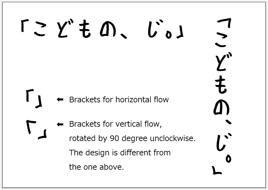
- Some fonts use different glyphs for parenthesis/brackets in vertical flow; e.g., U+FF62/FF63. kodomonoji_20111005-en.png
- Some fonts use U+301D/301F glyphs for U+201C/201D in vertical flow.
- Some fonts use GPOS to adjust positions of punctuation in vertical flow.
- For brush-stroke fonts, start and end edges of strokes (起筆/収筆 in Japanese) vary by flow direction for several glyphs, just like it does for U+30FC, because the direction brush moves is different; e.g., suzuedo.png
- Issues with non-square fonts:
- U does not work with proportional or non-square fonts. If a font is condensed (tall) in horizontal flow, it needs to be condensed (wide) in vertical flow; e.g., AXIS fonts
- S/SB does not work with slanted fonts; e.g., susha.png
- Does the baseline alignment work good by just rotation?
- EM DASH, Arrows, etc. aligns at center baseline?
- Most font designers I contacted believe that it’s ok as long as the font is a square font, but I’m worried as it has never been tested at all.
Potential Tailorings
- upright-cyrillic
- upright-greek
- upright-latin
- upright-letterlike
- sideways-symbols
- upright-math
- upright-numeric
- sideways-unified-punctuation-type-stuff?