Use Cases from Print Layouts for Regions
Changing gutter and column widths
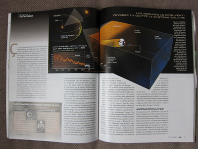
The layout above uses different column widths to generate visual interest. In this case, the column width differences are mirrored for the two-page spread. While on-screen paginated experiences tend to show one page at a time, this technique could be used in continuous media. If each pair of columns is shorter than the viewport height, the wider column could shift from side to side as the reader scrolls down.
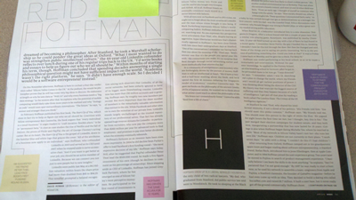
Here the layout uses the two-page spread to hold large graphics. Consider how something like this could look on a wide screen, with the placement of the text columns depending on the size and shape of the graphic elements. This particular arrangement could be generated with two regions (the second with multicol properties set).
Interleaved flows
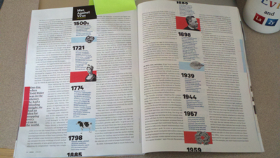
Here there are two named flows, but the contents are related. The flow running through the gutter of the main article is a timeline of events the article refers to. This can be accomplished in either continuous or paginated contexts with sets of three regions. Here's a paginated solution using Page Templates (assuming content to refer to and a box to paginate in). There is also a full mockup that works in the WebKit nightly build or Chrome 19 with the regions features turned on.
article {
  flow-into: article-flow
}
#timeline {
  flow-into: timeline-flow
}
#combine-articles {
  overflow-style: paged-x;
}

@template interleaved-layout{

  @slot left {
    width: 35%;
    float: left;
    flow-from: article-flow;
  }

  @slot time {
    width: 25%;
    float: left;
    flow-from: timeline-flow;
  }

  @slot right {
    width: 35%;
    float: left;
    flow-from: article-flow;
  }
}
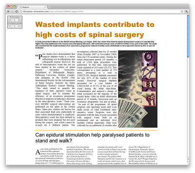
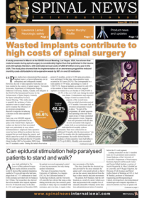
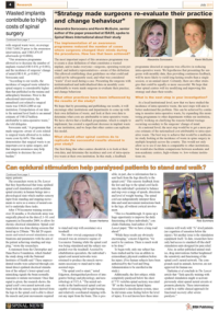
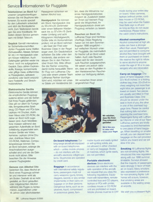
<HTML><div style=“margin: auto ; width: 50%”><p>The screenshot and link above show a document made of two articles interleaved. The document starts with region 1 of article 1, then region of article 2, a page of advertisement, then region 2 of article 1 and finally region 2 of article 2. Some of these regions are rendered in columns but that's only for consistency with the original document copied here. Controls are available in the top-left corner to increase or decrease the font size of the articles and the width of the content area.</p> <p>The demo works in Chrome 19 with the CSS Regions features turned on.</p> <p>The original paper version is <a href=“http://www.cxvascular.com/sn-newspaper-pdfs?DocumentScreen=detail&cl=352&ccs=673”>issue 20 of Spinal News</a> and is shown in three pages below.</p></div> </HTML>
Templates with multiple flows

This layout has two linked flows, one in German and one in English. The first page has different column settings for each flow, but the following page(s) have similar column characteristics (though twined together in an interesting way). This could be done with page templates that define one layout for the first page, then fall back to a repeating page template to contain the remainder of the articles.