This large example served as the motivational example in the introduction of the spec for a few years. It shows a complex layout using a lot of features, in some cases in a forced way just to include a feature. The example will be replaced in the spec with smaller, more focused examples.
Intro
Displaying the complex layouts of a typical magazine, newspaper, or textbook on the web requires capabilities beyond those available in existing CSS modules. Dynamic magazine layout in particular requires flexibility in placement of boxes for content flows. This is one purpose of the CSS regions module.
Consider the layout illustrated in this figure.
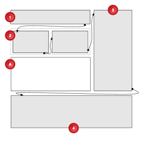
The designer’s intent is to position an image in box A and to flow an article’s content from box 1 through boxes 2, 3 and 4. Note that the second box should have two columns, and the image is not contained in the article. Box 4 should auto-size to render the remainder of the article content that did not fit in the earlier boxes.
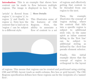
The next figure shows an example of the intended visual rendering of the content.
There is no existing mechanism in CSS to associate the content with these boxes arranged in this manner so that content flows as intended. The CSS regions module properties provide that mechanism.
The following example illustrates how an <article> element is placed in a named flow and how boxes marked with “region1”, “region2”, “region3” and “region4” IDs become CSS Regions that consume the “article-flow” content.
<style>
  article {
    flow-into: article-flow;
  }

  #region1, #region2, #region3, #region4 {
    flow-from: article-flow;
  }
</style>
The “article-flow” value on the flow-into property directs the article element to the “article-flow” named flow. Setting the flow-from property on block containers to “article-flow” makes them CSS Regions and associates the resulting region chain with the named flow: the flow is “poured” into the region chain.
Code
This was originally included in Appendix A with this note:
A multi-column element is used for #region2, which is a bit gratuitous here (because grid cells could be used). The reason to use a multi-column element is to illustrate that regions can be multi-column.
Similarly, the last region breaks out of the grid in this example merely to show that regions in a region chain do not need to share a single parent.
<style>
  #grid {
    width: 80vw;
    height: 110vh;
    grid-template: "aaa.d"
                   "....d"
                   "bbb.d"
                   "....d"
                   "ccc.d";
    grid-template-rows: 52% 4% 20% 4% 20%;
    grid-template-columns: 30% 5% 30% 5% 30%;
  }
  #region1 { grid-cell: a; }
  #region2 { grid-cell: b; }
  #boxA    { grid-cell: c; }
  #region3 { grid-cell: d; }

  #region4 {
    width: 80vw;
  }

  #region2 {
    column-count: 2;
  }

  /*
   * Creates the named flow
   */
  article {
    flow-into: article-flow;
  }

  /*
   * Associate it with the intended CSS Regions.
   * This creates a region chain for the named flow.
   */
  #region1, #region2, #region3, #region4 {
    flow-from: article-flow;
  }
</style>
<body>
  <!--
  The following article element is the content
  to flow through the region chain.
  -->
  <article>
    <h1>Introduction</h1>
    <p>This is an example ...</p>

    <h2>More Details</h2>
    <p>This illustrates ...</p>
    <p>Then, the example ...</p>
    <p>Finally, this ...</p>
  </article>

  !--
  The rest of the markup defines the layout.
  Grid is used in this example, but any method
  for creating boxes could be substituted.
  -->
  <div id="grid">
    <div id="region1"></div>
    <div id="region2"></div>
    <div id="boxA"></div>
    <content></content>
    <div id="region3"></div>
  </div>
  <div id="region4"></div>
</body>