Introduction
This page contains use cases for exclusions and comparative examples of markup using the CSS Exclusions and Shapes proposal.
Proposals
- CSS Exclusions and Shapes: [ http://dev.w3.org/csswg/css3-exclusions/ ]
UC 1: simple exclusion
One exclusion over two columns of content.
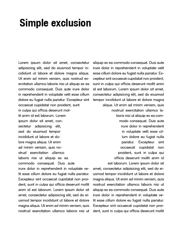
CSS Exclusions and Shapes
<html>
<head>
	<style type="text/css">

	#article{
		column-count: 2;
		column-gap: 1em;
	}

	/* with SVG shape */
	#shape{
		position: absolute;
		top: 50%;
		left: 50%;
		wrap-flow: both;
		shape-outside: circle(50%, 50%, 30%);
	}

	/* with image */
	 #shape{
		position: absolute;
		top: 50%;
		left: 50%;
		wrap-flow: both;
		shape-outside: url(mycircle.png);
		shape-image-threshold: 100%;
	}

	</style>
</head>
<body>
	<div id="shape"></div>
	<div id="article">
		Lorem ipsum dolor sit amet, consectetur adipisicing elit...
	</div>
</body>
</html>
UC 2: overlapping exclusions
Multiple overlapping exclusions that affect each other and the content around them.
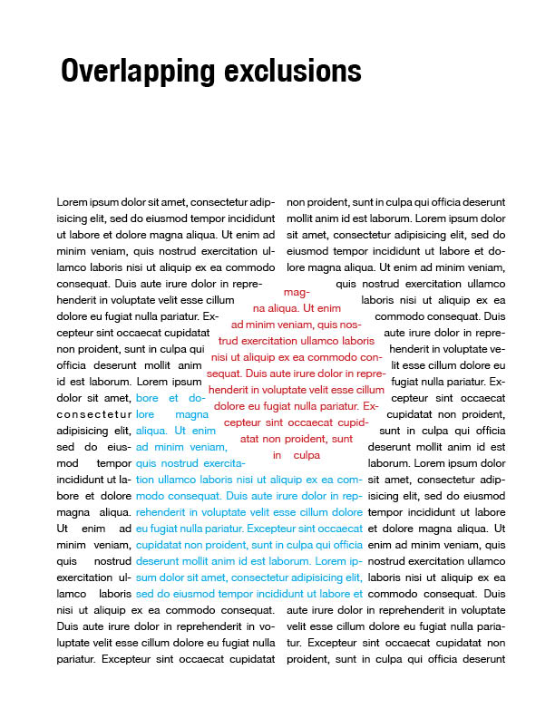
CSS Exclusions and Shapes
<html>
<head>
	<style type="text/css">

	#article{
		column-count: 2;
		column-gap: 1em;
	}

	#circle{
		position: absolute;
		top: 20%;
		left: 60%;
		color: red;

		z-index: 1; /* avoid being affected by #square */
		wrap-flow: both;
		wrap-margin: 10px;
		shape-outside: circle(50%, 50%, 30%);
	}

	/* will be affected by #circle because the z-index is 0 by default */
	#square{
		position:absolute;
		bottom:20%;
		left:30%;
		color:blue;

		wrap-flow: both;
		shape-outside: rect(10%, 50%, 200px 200px);
	}

	</style>
</head>
<body>
	<div id="shape1">magna aliqua. Ut enim ad minim ...</div>
	<div id="shape2">bore et dolore magna ...</div>
	<div id="article">
		Lorem ipsum dolor sit amet, consectetur adipisicing elit...
	</div>
</body>
</html>
UC 3: repeating shapes
Repeating exclusion shape on x, y or both axes.
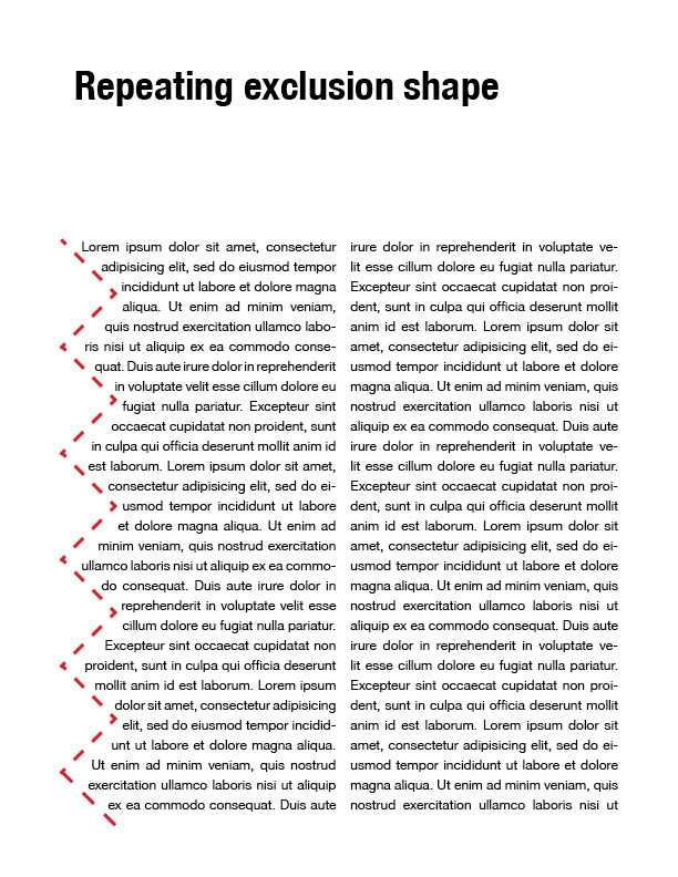
CSS Exclusions and Shapes
No support for repeating exclusion shapes. Solution:TBD<html>
<head>
<style type="text/css">
#article{
column-count: 2;
column-gap: 1em;
}
#shape{
position:absolute;
height:100%;
width:20px;
left:0;
}
</style>
</head>
<body>
<div id="shape"></div>
<div id="article">
Lorem ipsum dolor sit amet, consectetur adipisicing elit...
</div>
</body>
</html>
UC 4: disjoint shapes
Multiple disjoint shapes that compose an exclusion
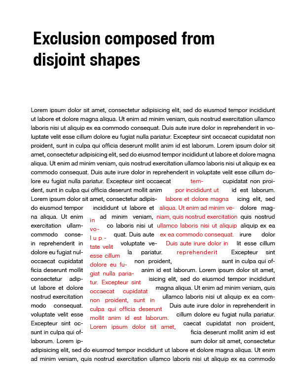
Resources:
Image to determine the disjoint shapes by alpha channel transparency.

CSS Exclusions and Shapes
Multiple solutions possible with single image, multiple positioned images or SVG shapes.
<html>
<head>
	<style type="text/css">

	#article{
		width:100%;
		column-count: 2;
		column-gap: 1em;
	}

	/* with SVG paths */
	#disjoint-article{
		position: absolute;
		width: 100%;
		height: 380px;
		color: red;
		bottom: 0;

		wrap-flow: both;
		wrap-padding: 10px;
		/* circle and triangle SVG shapes */
		shape-outside: circle(cx,cy,r), polygon(x1, y1, x2, y2, x3, y3);

		/* the shape-inside propery for content inherits from shape-outside so we can ignore declaring it */
	}


	/* with image */
	#disjoint-article{
		position: absolute;
		width: 100%;
		height: 380px; /* disjoint-shapes-mask.png height*/
		color: red;
		bottom: 0;

		wrap-flow: both;
		shape-image: url("disjoint-shapes-mask.png");
		shape-image-threshold: 100%;
	}

	</style>
</head>
<body>
	<div id="disjoint-article">
         nousmod tempor inciditunt ut...
	</div>

	<div id="article">
		Lorem ipsum dolor sit amet, consectetur adipisicing elit...
	</div>
</body>
</html>
UC 5: reusable exclusion
Reuse an exclusion shape on different elements
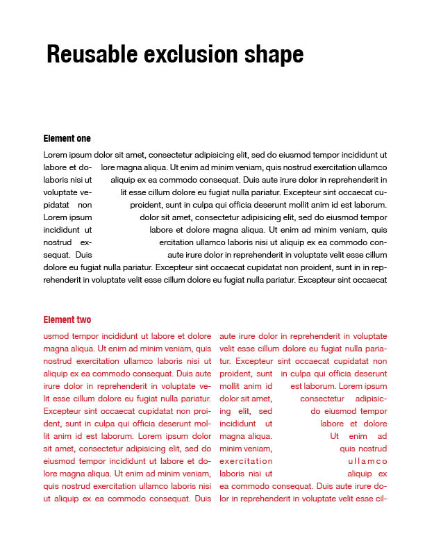
CSS Exclusions and Shapes
- low reusability: requires duplication of markup ```html
Lorem ipsum dolor sit amet, consectetur adipisicing elit...
Lorem ipsum dolor sit amet, consectetur adipisicing elit...
## UC 6: shape transforms
Apply transformations (scale, skew, rotate) to an exclusion shape.
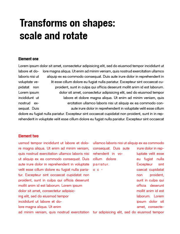
### CSS Exclusions and Shapes
(!) Content inside the shape will have transformations applied, as well
```html
<html>
<head>
<style type="text/css">
#article1{
position: relative;
}
#article2{
position: relative;
column-count: 2;
column-gap: 1em;
color: red;
}
/* with SVG Shape */
.exclusion{
position: absolute;
wrap-flow: both;
shape-outside: polygon(x1, y1 ... xn, yn);
}
/* with image */
.exclusion{
width:100px; /* width of triangle.png */
height:200px; /* height of triangle.png */
position:absolute;
wrap-flow: both;
shape-image: url("triangle.png");
shape-image-threshold: 100%;
}
#article1 .exclusion{
top: 50%;
left: 30%
}
#article2 .exclusion{
top: 50%;
left: 70%;
/* increase scale, then flip on x-axis */
transform: scale(1.5) scale(1, -1);
}
</style>
</head>
<body>
<div id="article1">
<div class="exclusion"></div>
Lorem ipsum dolor sit amet, consectetur adipisicing elit...
</div>
<div id="article2">
<div class="exclusion"></div>
Lorem ipsum dolor sit amet, consectetur adipisicing elit...
</div>
</body>
</html>
UC 7: padding and margin on custom shape
Custom-shaped container with margin for outer content and padding for inner content
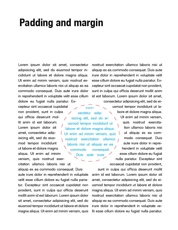
CSS Exclusions and Shapes
<html>
<head>
	<style type="text/css">

	#article{
		column-count: 2;
		column-gap: 1em;
	}

	/* with SVG shape */
	#shape{
		position: absolute;
		top: 50%;
		left: 50%;
		color: blue;

		wrap-flow: both;
		shape-outside: polygon(x1, y1, ... xn, yn);
		wrap-margin: 15px;
		wrap-padding: 5px;
	}

	</style>
</head>
<body>
	<div id="shape">consectur adipisicing elit, sed</div>
	<div id="article">
		Lorem ipsum dolor sit amet, consectetur adipisicing elit...
	</div>
</body>
</html>
UC 8: background image and container shape
Custom-shaped container with a background image / background color.
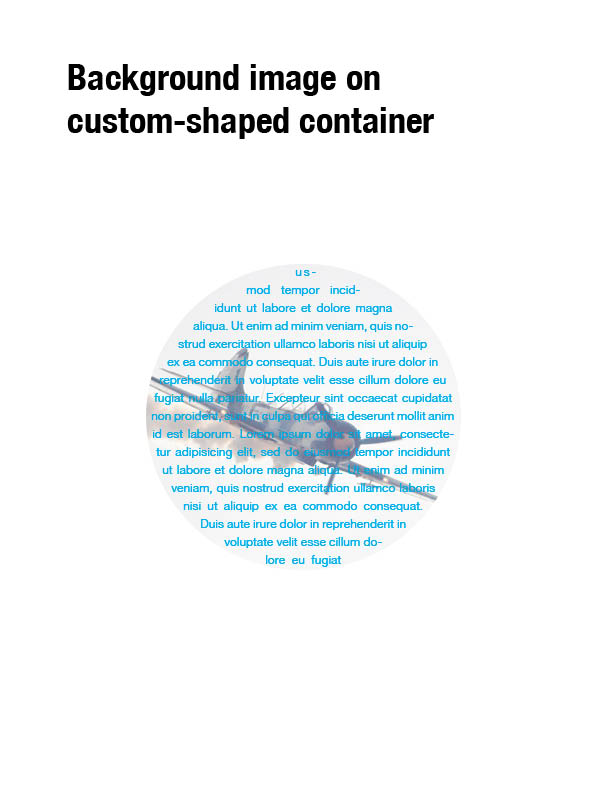
CSS Exclusions and Shapes
<html>
<head>
        <circle id="myCircle" cx="50%" cy="50%" width="50%" height="50%" />
	<style type="text/css">

	/* with SVG shape */
	#article{
		shape-inside: url(#myCircle);
		wrap-padding: 10px;
		background-image: url(airplane.png);
		color:blue;
	}

	</style>
</head>
<body>
	<div id="article">
		Lorem ipsum dolor sit amet, consectetur adipisicing elit...
	</div>
</body>
</html>
UC 9: Drop Cap
One exclusion along a text.
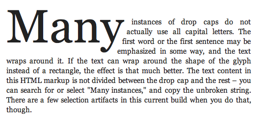
CSS Exclusions and Shapes
<style>
	/* with SVG shape */
	 #dropMany{
		wrap-flow: right;
		shape-outside: polygon(0px,0px 280px,0px 220px,125px 0px,125px);
	}

	/* with image */
	 #dropMany{
		wrap-flow: right;
		shape-image: url(shape-for-many.png);
		shape-image-threshold: 100%;
	}
</style>
<div>
     <p><span id="dropMany">Many</span> instances ...</p>
     <p>The text ....</p>
</div>